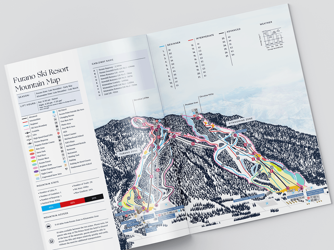
Overview
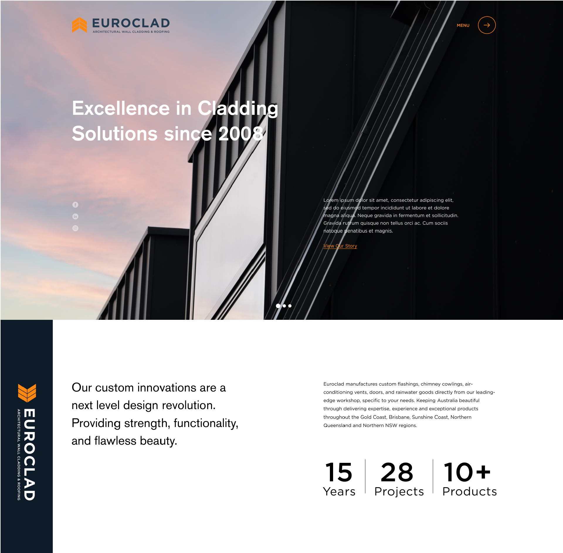
Euroclad's website suffered from poor information hierarchy, excessive text density, and an outdated visual language that no longer reflected the brand. The redesign aimed to improve content legibility, user flow, and overall visual quality.
Euroclad's website suffered from poor information hierarchy, excessive text density, and an outdated visual language that no longer reflected the brand. The redesign aimed to improve content legibility, user flow, and overall visual quality.
Constraints
The brief specified a fixed vertical navigation on the left side. Screen real estate on the right-hand side had to accommodate varied content types, product information, imagery, and calls to action without feeling cluttered.
The brief specified a fixed vertical navigation on the left side. Screen real estate on the right-hand side had to accommodate varied content types, product information, imagery, and calls to action without feeling cluttered.
Process
I conducted benchmark research across competitors and industry trends to identify patterns in modern web layouts. Based on those findings, I proposed a scroll-driven structure with section-based content segmentation, moving away from long, undifferentiated pages toward a layout where each scroll section serves a single purpose.
I conducted benchmark research across competitors and industry trends to identify patterns in modern web layouts. Based on those findings, I proposed a scroll-driven structure with section-based content segmentation, moving away from long, undifferentiated pages toward a layout where each scroll section serves a single purpose.
Motion and fine lines were introduced as structural elements to guide the eye and add depth without visual noise. Typography and spacing were recalibrated to reduce cognitive load and improve readability across device sizes.
Outcome
A modernised, scroll-driven website with clear content segmentation, improved visual hierarchy, and a refined aesthetic, designed entirely within the constraints of the fixed left-side navigation.
A modernised, scroll-driven website with clear content segmentation, improved visual hierarchy, and a refined aesthetic, designed entirely within the constraints of the fixed left-side navigation.
Website: euroclad.com.au
Agency: Made Agency